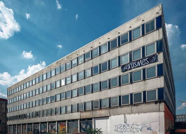
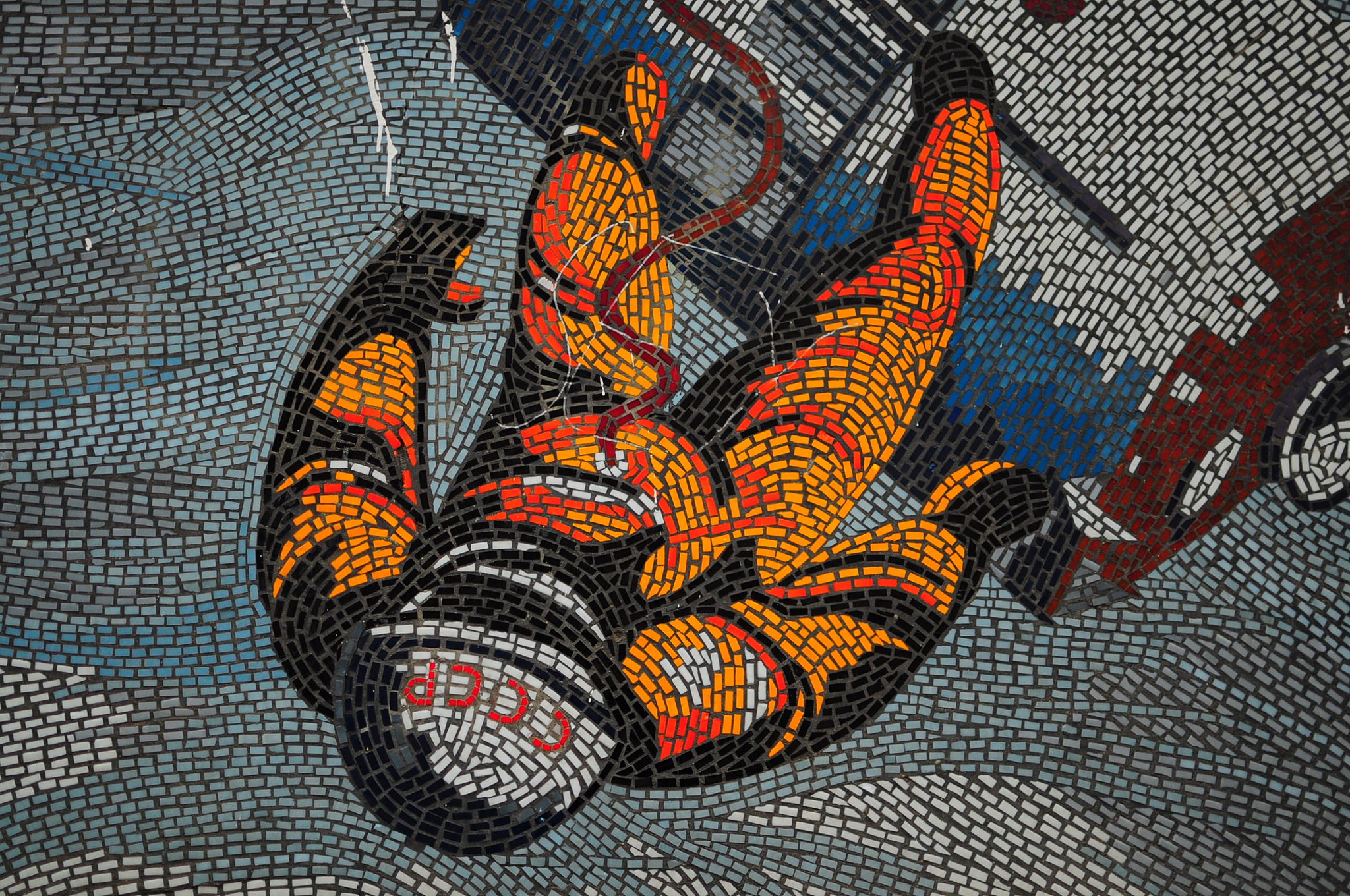
The Rechenzentrum as a creative hub in the heart of Potsdam was given a visual identity through the development of a corporate design. The building’s unmistakable hallmark is the facade mosaic, which is also reflected in an abstracted form within the brand identity.
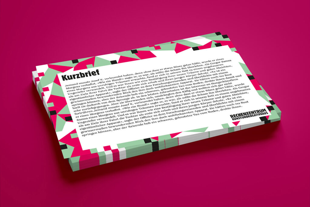
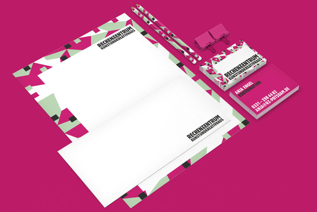
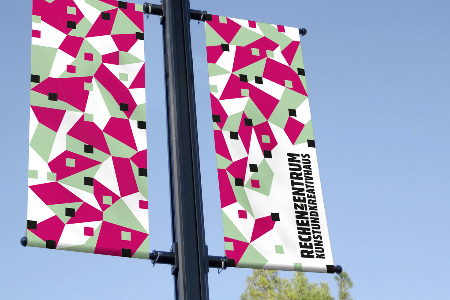
Concept: Mosaic
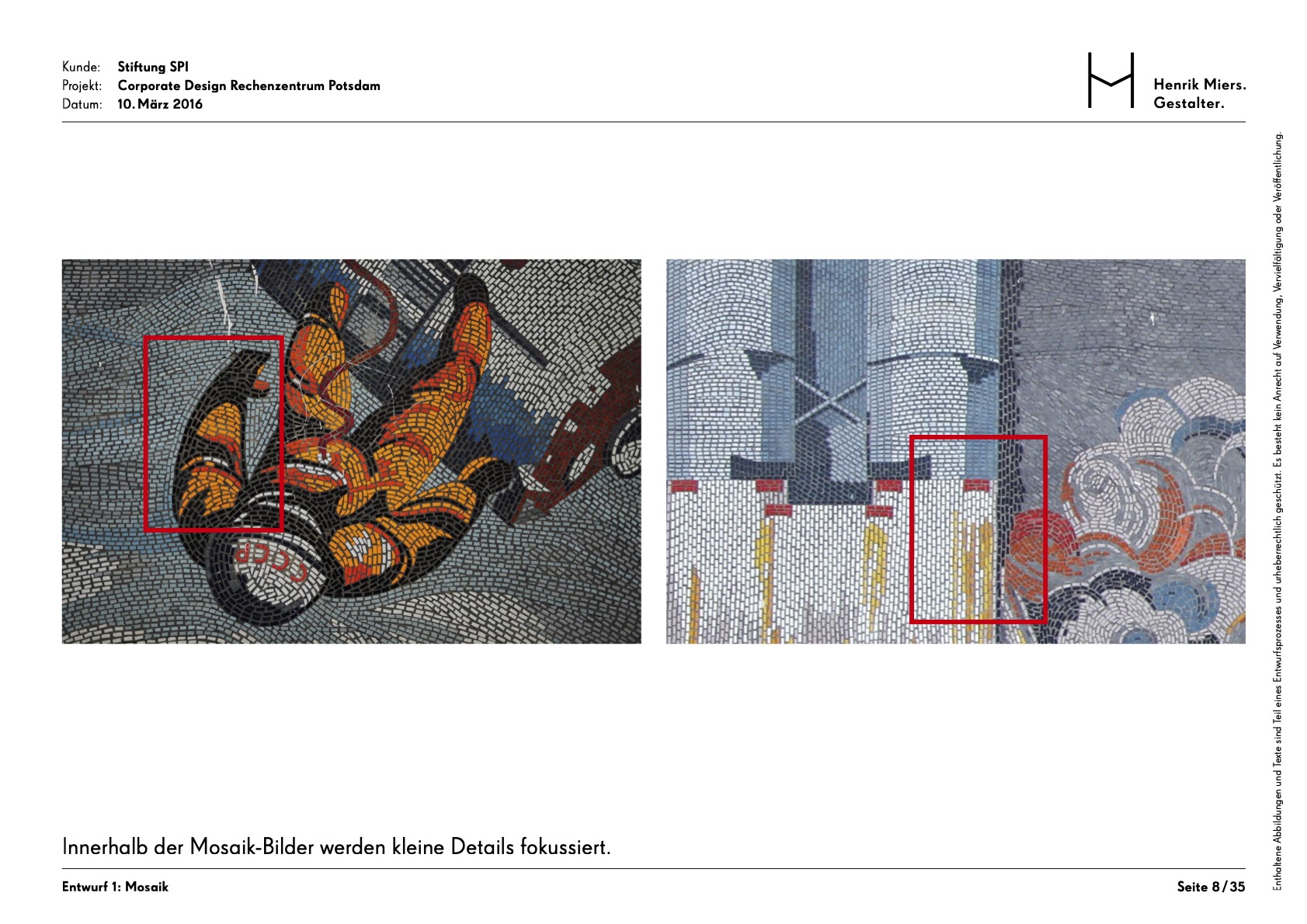
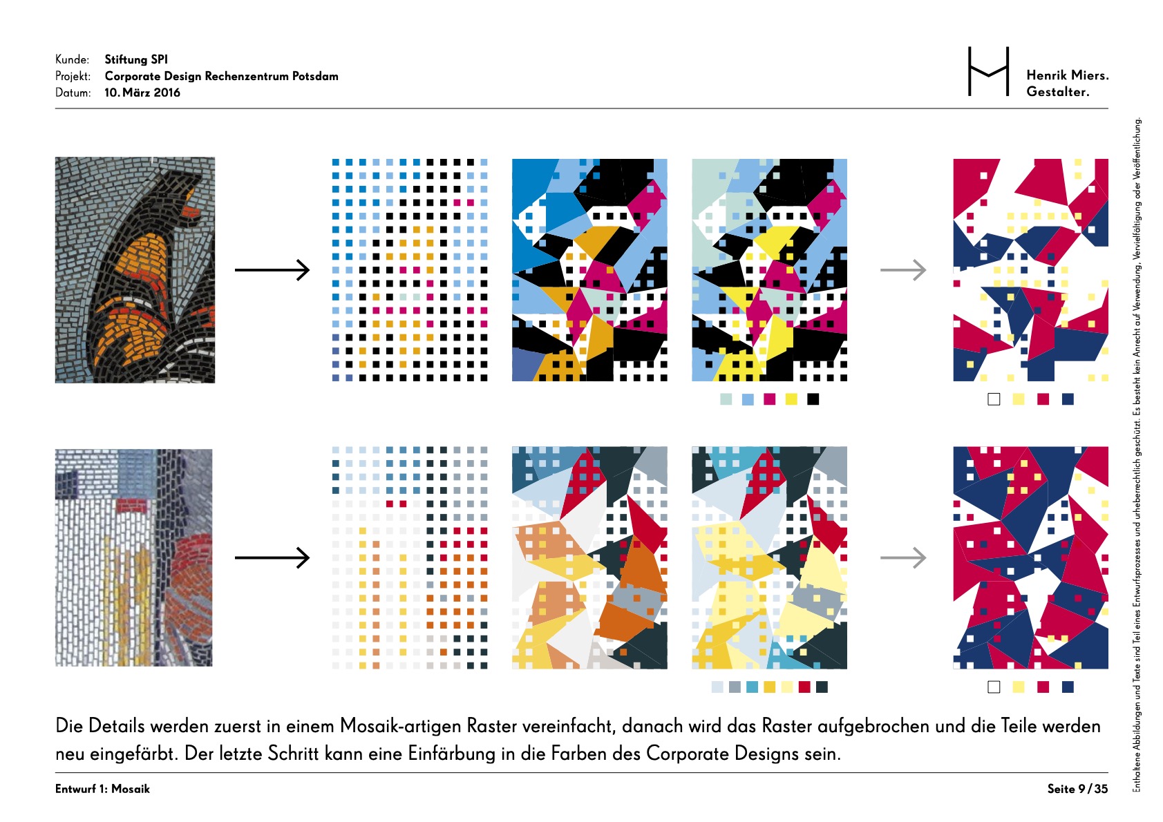
The “Mosaik” concept is directly derived from the building’s physical landmark: the large mosaic integrated into its architecture. This physical feature serves as a metaphor for the social structure of the house, where numerous individual tenants collectively form a larger, vibrant community. To translate this into a visual language, small details from the original mosaic images are isolated and simplified into a geometric, grid-like raster. This grid is then creatively “broken open” and re-colored, allowing for a modern interpretation of the building’s heritage while maintaining a clear, recognizable link to the physical site.
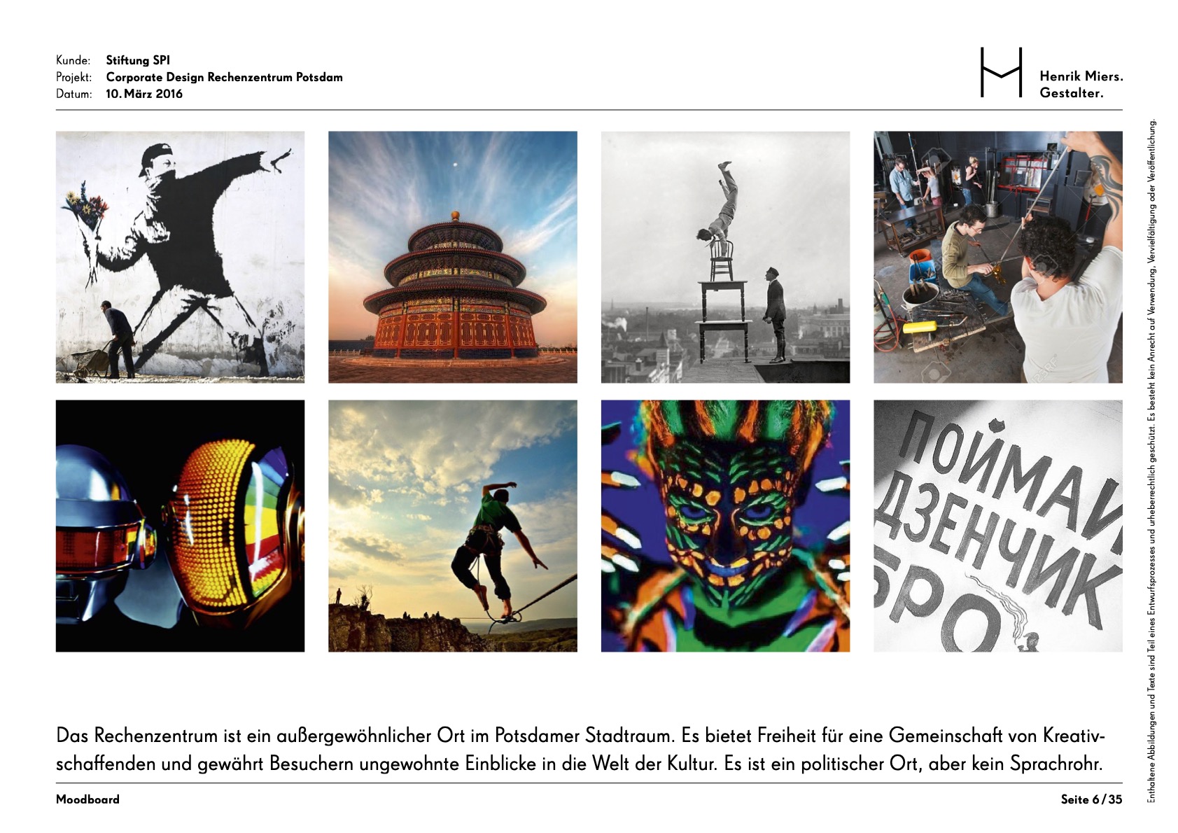
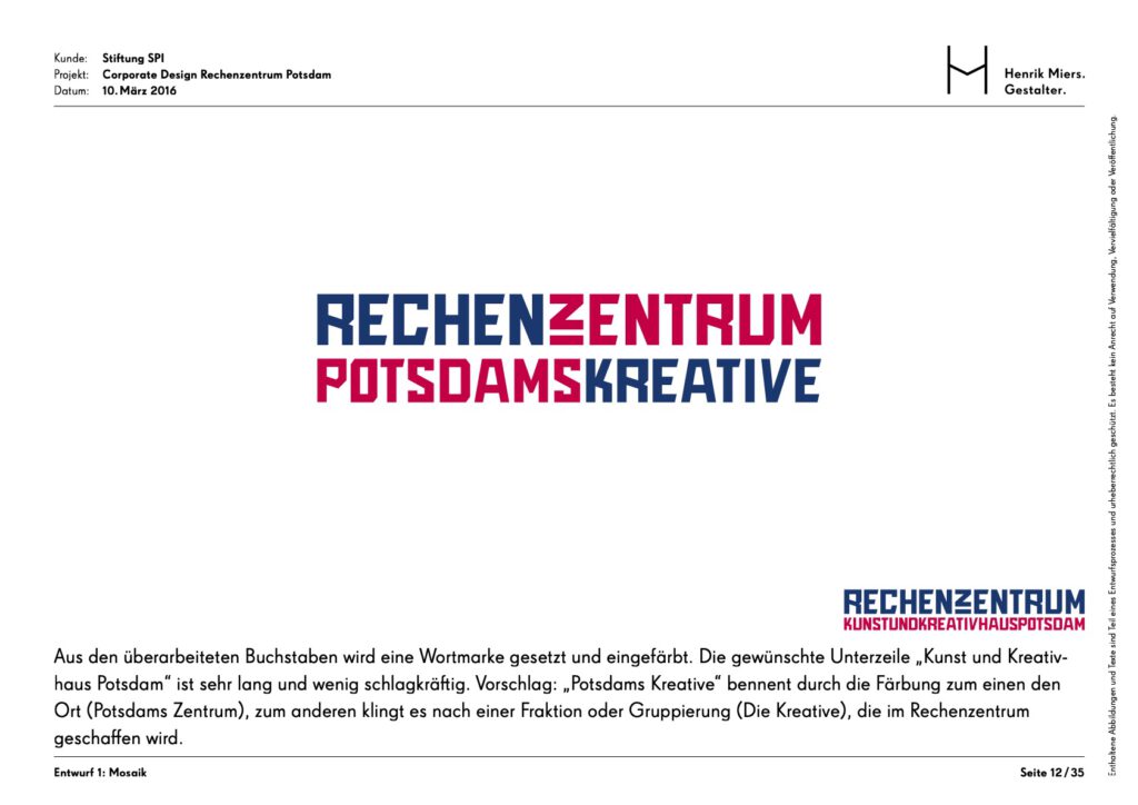
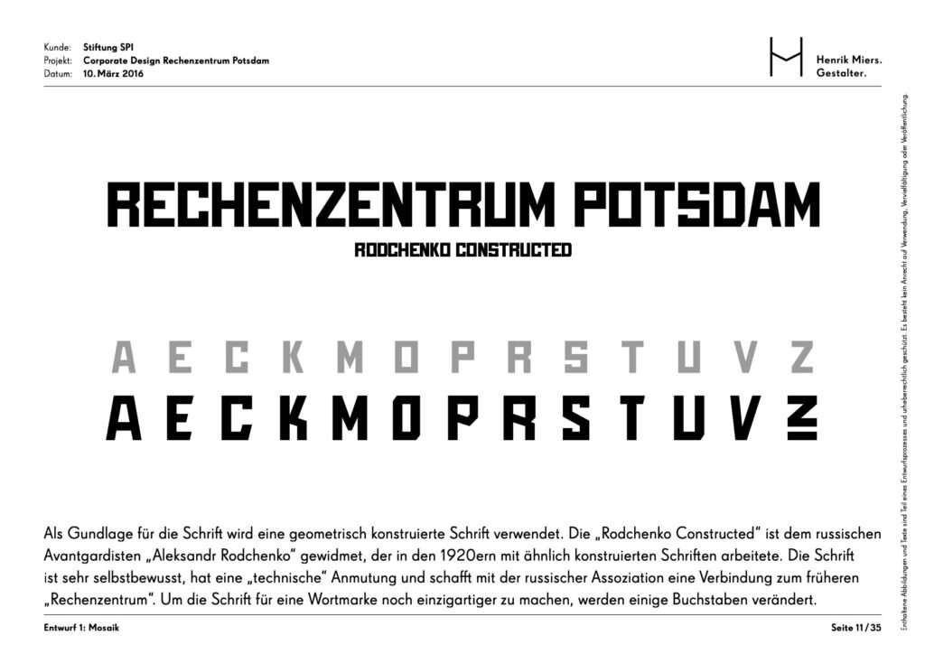
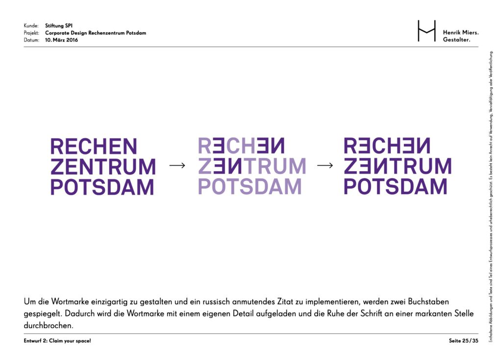
The concept bridges the building’s historical identity as a former data center with its modern role as a hub for Potsdam’s creatives. By using the “Rodchenko Constructed” typeface, which is inspired by the Russian avant-garde, the design creates a self-confident and technical aesthetic that evokes the site’s technological past. This approach fulfills the objective of creating an extraordinary urban space that honors its history while providing a flexible, multifaceted platform for a diverse community, where the nearly infinite variations of the mosaic graphics reflect the variety of cultural activities within.
Concept: Claim Your Space!
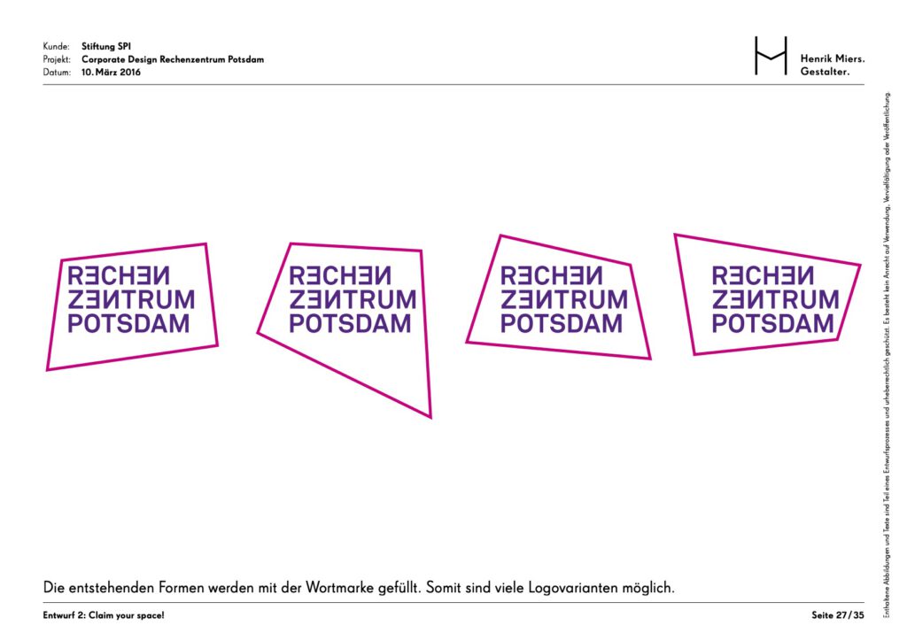
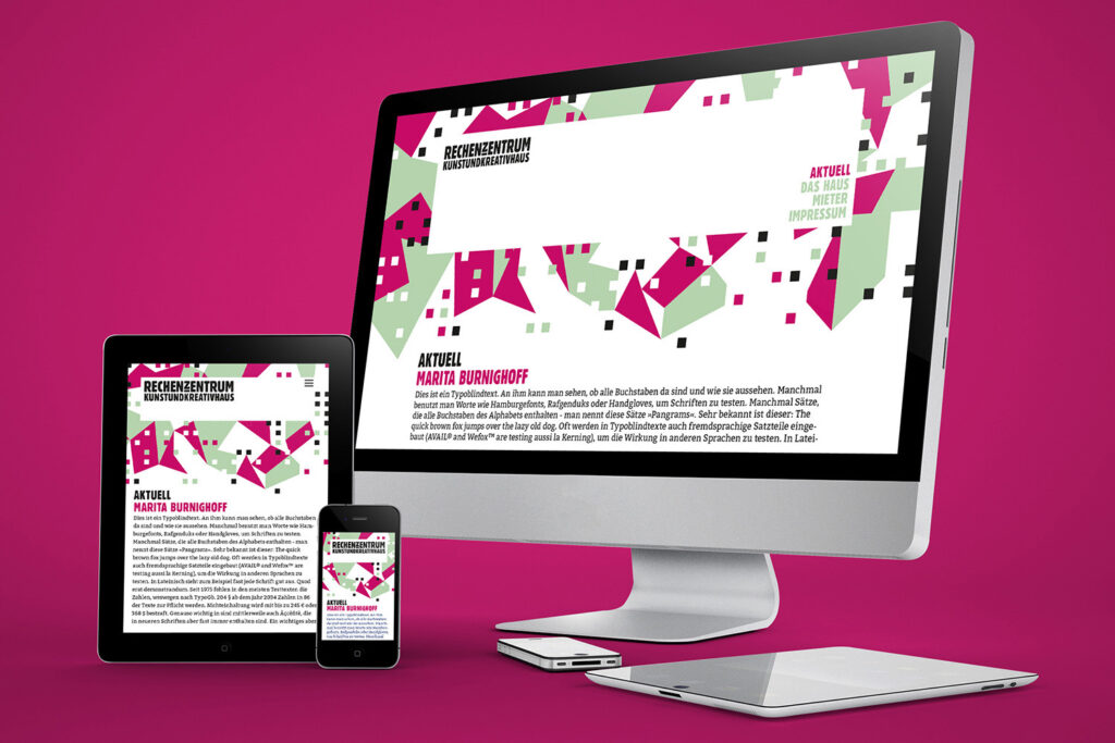
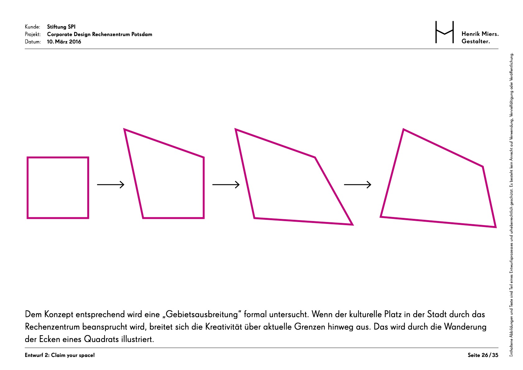
This concept centers on the proactive and transformative nature of the creative community in an urban environment where cultural spaces are scarce. The core idea is “territorial expansion,” representing the act of creatives claiming their own space and influencing their surroundings. This is visualized through the “migration” of the corners of a square, creating dynamic, evolving shapes that symbolize how creativity breaks through existing boundaries. It positions the Rechenzentrum as a bold “Freiraum” (free space) that actively invites occupation and engagement.
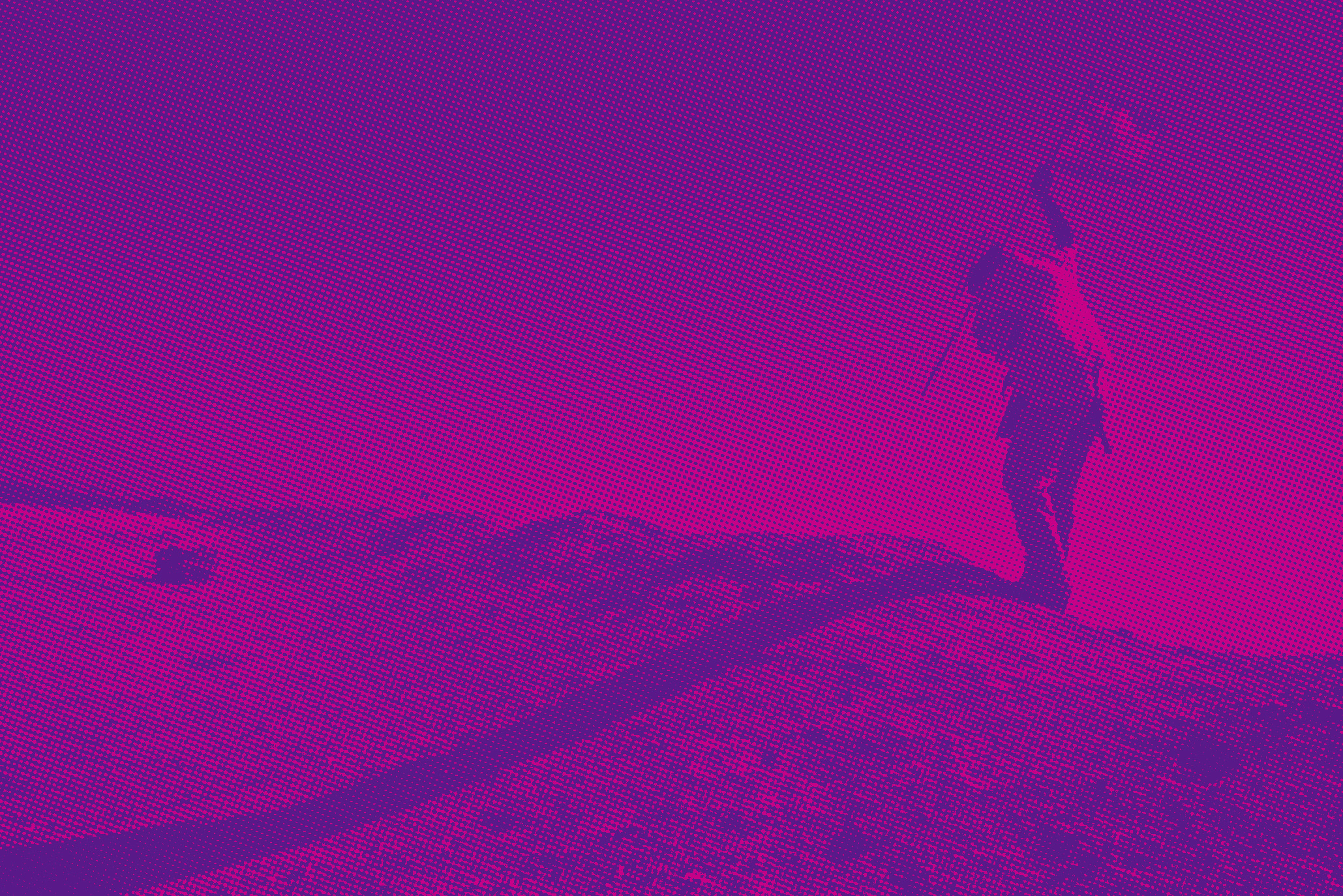
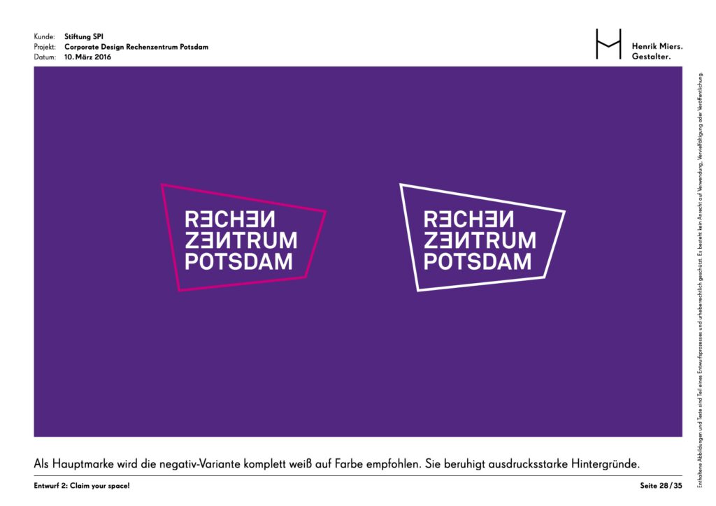
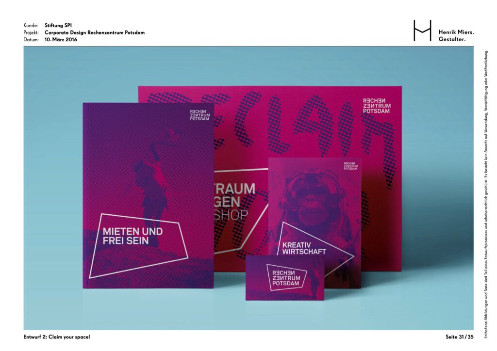
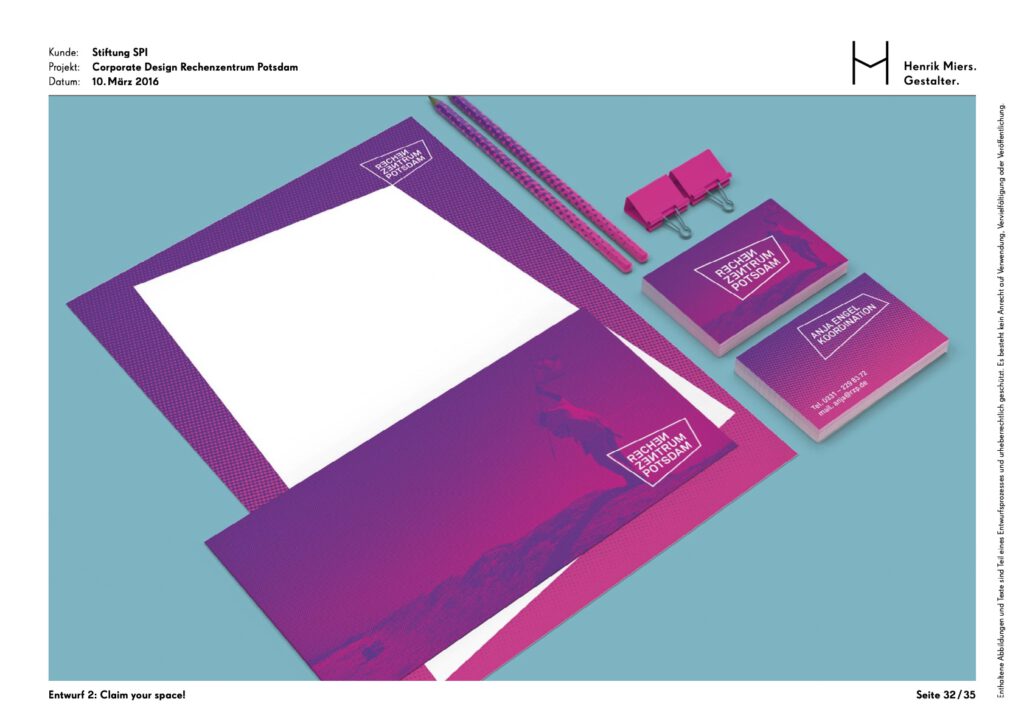
This design captures the essence of a political yet independent cultural site that seeks to spark curiosity through bold visibility. By utilizing a unique color palette of deep violet and bright magenta the brand ensures its status as a distinct and unmistakable presence in the city. The high-contrast, rasterized imagery of flag placements reinforces the theme of “claiming territory,” while the precise “Akkurat Bold” typography provides a necessary calm and professional counterpoint to the expressive visual material, ensuring that the center is perceived as both a creative and professional destination.